

Designing for All Users in Web Development
In the ever-evolving landscape of web development, creating inclusive and accessible designs is not just a trend but a crucial aspect of ethical and effective digital presence. Designing for all users means going beyond aesthetics and functionality to ensure that every individual, regardless of ability or context, can navigate and engage with websites seamlessly. This approach encompasses diverse needs such as visual impairments, motor disabilities, cognitive differences, and varying technological access. Accessibility in web development involves employing practices like clear navigation structures, scalable fonts, and color schemes that accommodate color blindness. It also means optimizing for assistive technologies such as screen readers and ensuring compatibility across different devices and browsers. By prioritizing inclusivity, developers not only enhance user experience but also adhere to legal standards and demonstrate social responsibility. In this blog series, we explore practical strategies and best practices for designing websites that are truly accessible to all users, contributing to a more equitable digital environment.
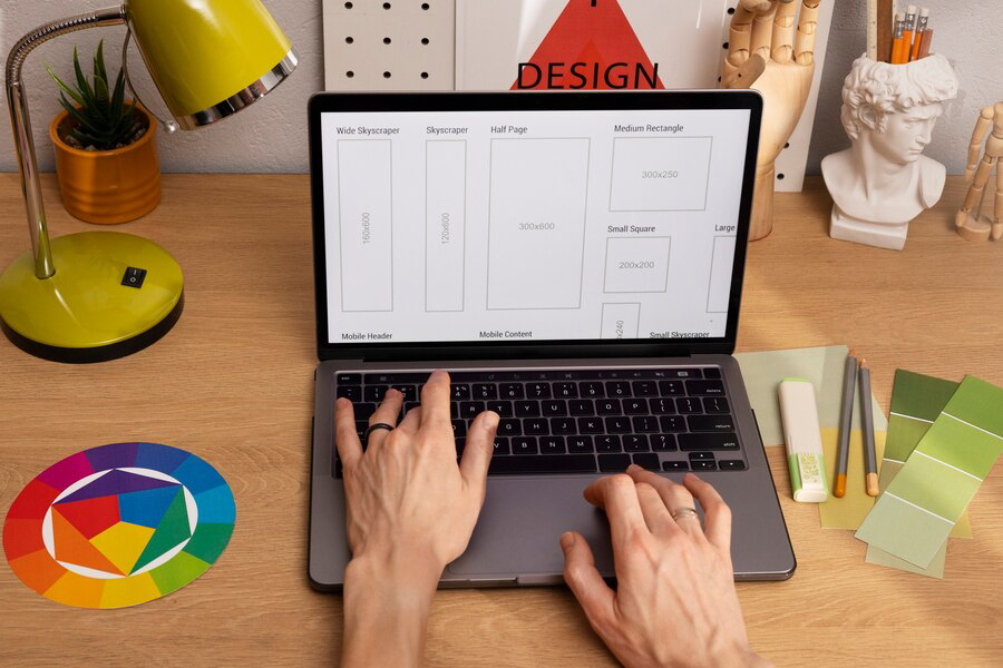
Incorporating Responsive Design for Enhanced User Experience
In today's digital landscape, where users access websites from a multitude of devices—ranging from smartphones and tablets to desktop computers—it's imperative for web developers to prioritize responsive design. Responsive design ensures that websites adapt seamlessly to different screen sizes and devices, providing an optimal viewing and interaction experience for all users. Let's explore why responsive design matters and how you can effectively incorporate it into your web development process.
Understanding the Importance of Responsive Design
Responsive design isn't just about aesthetics; it's about usability and accessibility. A website that looks great and functions well on a desktop but becomes clunky or unusable on a mobile device can deter users and harm your brand's reputation. By embracing responsive design principles, you acknowledge the diverse ways users access your site and aim to provide a consistent and enjoyable experience across all platforms.

Key Principles of Responsive Design
At its core, responsive design operates on several key principles: Fluid Grids: Using relative units like percentages rather than fixed pixels for layout, allowing content to adapt fluidly. Flexible Images: Ensuring images can scale appropriately to fit different screen sizes without losing quality or breaking the layout. Media Queries: Implementing CSS media queries to apply different styles based on device characteristics such as screen width, orientation, and resolution.
Implementing a Mobile-First Approach
A mobile-first approach involves designing for the smallest screen size first, then progressively enhancing the design for larger screens. This strategy ensures that your website remains functional and user-friendly on mobile devices, where space is limited and touch interactions are prevalent.
Prioritizing Content and Functionality
In responsive design, prioritizing content and functionality is crucial. Consider the most critical elements users need to access on each device and ensure they are easily reachable. This might involve reordering navigation menus, resizing buttons for touch interaction, or collapsing less essential content on smaller screens.
Optimizing Performance Across Devices
Performance optimization goes hand-in-hand with responsive design. Ensure your website loads quickly on all devices by optimizing images, minifying CSS and JavaScript files, and leveraging browser caching. A fast-loading site not only enhances user experience but also improves SEO and reduces bounce rates.
Typography and Readability: Designing for All Users
Typography plays a crucial role in web design beyond just aesthetics; it significantly impacts readability and user experience. Whether your audience includes individuals with visual impairments, those accessing your site on mobile devices, or anyone seeking clear, accessible content, understanding typography principles is essential. In this article, we'll explore how typography influences readability and provide practical tips for designing inclusive and user-friendly websites.
Importance of Typography in Web Design
Typography encompasses font selection, size, spacing, and arrangement of text elements on a web page. It directly affects how users perceive and interact with content. Clear typography enhances readability, guides users through information, and establishes the visual identity of a website.
Choosing the Right Fonts
When selecting fonts for your website, prioritize readability over novelty. Sans-serif fonts like Arial, Helvetica, or Roboto are commonly recommended for digital content due to their clean and straightforward appearance. Serif fonts such as Times New Roman can be suitable for longer passages of text in certain contexts but may be less readable on screens, especially at smaller sizes.
Font Size and Line Spacing
Optimal font size and line spacing contribute significantly to readability, especially for users with visual impairments or when viewing content on smaller screens. Aim for a minimum font size of 16 pixels for body text and adjust line spacing (leading) to approximately 1.5 times the font size to improve legibility.
Contrast for Accessibility
High contrast between text and background colors improves readability, particularly for users with low vision or color blindness. Ensure sufficient contrast ratios between text and background colors by using tools like WebAIM's Contrast Checker. Avoid placing text over complex or textured backgrounds that may interfere with readability.
Responsive Typography
Responsive typography adapts to different screen sizes and resolutions to maintain readability across devices. Use relative units like percentages or ems for font sizes and line heights rather than fixed pixels. Implement CSS media queries to adjust typography styles based on viewport width, ensuring optimal legibility on both desktops and mobile devices.
Optimizing Navigation for Intuitive User Interaction
Efficient navigation is the backbone of a user-friendly website. It ensures visitors can find information quickly and navigate seamlessly across pages. Optimizing navigation for intuitive user interaction not only enhances usability but also improves overall user satisfaction. Here are key points to consider:
- Clear Structure and Organization: Organize navigation menus logically, grouping related pages or sections together. Use descriptive labels that are easily understandable to users. Avoid overwhelming users with too many options; prioritize clarity and simplicity.
- Consistent Navigation Elements: Maintain consistency in navigation elements across all pages of the website. Users rely on familiar navigation patterns to orient themselves and navigate efficiently. Consistent placement of menus and navigation bars enhances usability.
- Responsive Design for Accessibility: Ensure navigation is responsive and accessible across different devices and screen sizes. Use mobile-friendly navigation patterns such as hamburger menus or collapsible navigation bars for smaller screens. Test navigation functionality across devices.
- Use of Visual Cues: Incorporate visual cues such as hover effects, breadcrumbs, or highlighted active links to indicate the user's current location within the website. Visual cues help users understand where they are and how to navigate further.
Conclusion
Designing for all users in web development isn't just about accessibility; it's about inclusivity and user-centered design. By prioritizing accessibility standards such as screen reader compatibility, keyboard navigation, and color contrast, we ensure that everyone, regardless of ability or device, can access and interact with digital content seamlessly. Moreover, integrating responsive design principles allows websites to adapt to various screen sizes, enhancing user experience across desktops, tablets, and smartphones.
At Ideation Digital
Marketing, we are committed to crafting web experiences that prioritize inclusivity without compromising on aesthetic or functionality. Whether you're a small business in Charleston or a global enterprise, our team is dedicated to implementing best practices in web accessibility and design. For further inquiries on how we can tailor our services to meet your specific needs, please don't hesitate to contact us at (304) 814-2445 or visit our website at ideationdigital.com. Let's collaborate to create digital solutions that resonate with all users, empowering your online presence effectively.
FOLLOW US