222 Capitol Street, Suite 522
Charleston, WV 25301


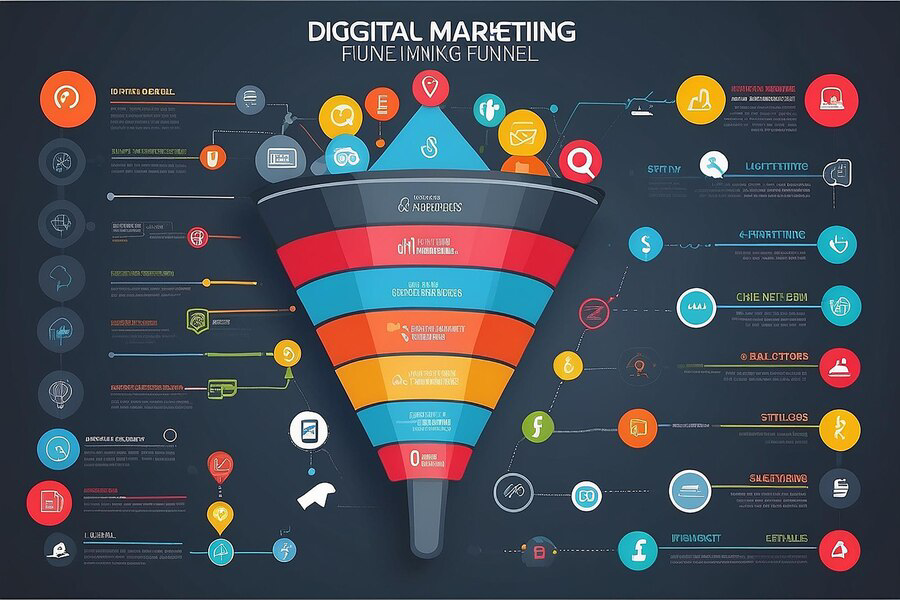
Mobile Marketing Strategies for E-commerce Success
In today's hyper-connected digital landscape, mobile marketing has emerged as a cornerstone for e-commerce success. As more consumers shift towards mobile devices for their shopping needs, businesses must refine their strategies to effectively engage this audience. Mobile marketing encompasses a spectrum of tactics, from responsive website design and mobile-friendly content to targeted advertising campaigns tailored for smartphone users. For e-commerce businesses, mastering mobile marketing is not merely advantageous but essential for staying competitive. It involves optimizing user experience across all mobile platforms, leveraging apps for seamless transactions, and harnessing the power of social media and location-based services to drive conversions. This blog explores key mobile marketing strategies that can empower e-commerce ventures to reach and resonate with their mobile-centric audience, ultimately fostering greater customer loyalty and boosting sales in the dynamic world of online retail.
Introduction to Optimizing Mobile Website Performance
In today's digital age, where mobile devices dominate internet usage, ensuring your e-commerce website performs optimally on mobile is crucial. Mobile users expect fast loading times, smooth navigation, and seamless functionality. A well-optimized mobile website not only enhances user experience but also boosts conversions and improves search engine rankings. Here are eight essential strategies to optimize your mobile website performance:
Responsive Design for All Devices
Responsive web design ensures your website adapts seamlessly to different screen sizes and devices. This approach eliminates the need for separate desktop and mobile sites, providing a consistent user experience across all platforms. Implement CSS media queries to adjust layout and content based on screen dimensions, ensuring readability and usability on smaller screens without sacrificing design elements.
Prioritize Speed and Loading Times
Mobile users are typically on the go and have little patience for slow-loading websites. Aim for fast loading times—ideally under three seconds—to prevent users from abandoning your site. Techniques such as minimizing HTTP requests, optimizing images and code, and leveraging browser caching can significantly improve loading speeds. Tools like Google PageSpeed Insights can help identify performance bottlenecks and suggest optimizations.
Simplify Navigation and User Interface
Streamline navigation on your mobile site to enhance user experience. Utilize a clean, intuitive interface with easily accessible menus and navigation bars. Consider implementing sticky headers or hamburger menus to conserve screen space while providing easy access to essential site sections. User-friendly interfaces reduce bounce rates and encourage visitors to explore your e-commerce offerings.
Optimize Images and Multimedia Content
Images and multimedia content play a crucial role in engaging mobile users, but they can also slow down your website if not optimized. Compress images without compromising quality, utilize modern image formats like WebP for faster loading, and lazy load images to defer loading off-screen images until they are needed. Minimize the use of auto-playing videos or animations that may consume excessive bandwidth.
Implement Accelerated Mobile Pages (AMP)
Accelerated Mobile Pages (AMP) are lightweight versions of web pages designed to load quickly on mobile devices. AMP strips down unnecessary elements like JavaScript and prioritizes content delivery speed. Implementing AMP for static content pages such as product descriptions or blog posts can improve loading times and enhance mobile user experience, potentially boosting organic search rankings.

Creating Mobile-Friendly Content
In the era of mobile dominance, crafting content that resonates with mobile users is crucial for the success of any e-commerce venture. Mobile-friendly content not only engages users effectively but also enhances their overall experience, leading to higher conversion rates and improved brand loyalty. To maximize your e-commerce success in the mobile landscape, here are eight essential strategies for creating mobile-friendly content:
Prioritize Conciseness and Clarity
Mobile users typically have shorter attention spans and limited screen space. Opt for concise, easy-to-digest content that delivers your message quickly and effectively. Use short paragraphs, bullet points, and subheadings to break down information into easily scannable chunks. Avoid jargon and unnecessary filler content, focusing instead on providing clear value and addressing user needs promptly.
Optimize Content for Mobile Viewing
Ensure your content is visually appealing and legible on smaller screens. Choose a readable font size and typeface that adapts well to various devices. Use responsive design principles to adjust images, videos, and other multimedia elements for optimal viewing on mobile screens. Test your content across different devices and screen sizes to ensure consistency and readability.
Leverage Engaging Visuals and Multimedia
Visual content such as images, infographics, and videos can captivate mobile users and convey information more effectively than text alone. Use high-quality visuals that load quickly and enhance the user experience. Optimize images for mobile devices by compressing files without sacrificing quality and utilizing modern image formats like WebP for faster loading times.
Implement Mobile-First Design Principles
Adopt a mobile-first approach when designing content and layouts for your e-commerce site. Prioritize the mobile user experience by structuring content to fit smaller screens first, then scaling up for desktops and tablets. Use touch-friendly elements such as larger buttons and interactive features that are easy to navigate on touchscreens. Design with mobile users' needs and behaviors in mind to maximize engagement and conversions.
Craft Compelling Calls-to-Action (CTAs)
Effective CTAs are essential for guiding mobile users toward desired actions, such as making a purchase or subscribing to a newsletter. Ensure CTAs are prominently displayed, using contrasting colors and clear language that stands out on mobile screens. Keep CTAs concise and action-oriented, avoiding unnecessary text or distractions that may dilute their effectiveness. Test different CTA placements and designs to optimize conversion rates.
Mobile SEO Strategies
In today's mobile-centric world, optimizing your e-commerce site for mobile search engines is essential for reaching and engaging a broader audience. Mobile SEO strategies focus on ensuring your website not only ranks well but also provides a seamless experience for mobile users. Here are key strategies to boost your mobile SEO efforts:
- Responsive Design: Ensure your site is responsive and adjusts seamlessly to different screen sizes, providing a consistent user experience across devices.
- Page Speed Optimization: Improve loading times by compressing images, minifying CSS and JavaScript, and leveraging browser caching.
- Mobile-Friendly Content: Create concise, easily readable content and optimize titles, meta descriptions, and headings for mobile search.
- Optimize for Local Search: Use local keywords and ensure your business information is accurate and consistent across directories.
Conclusion
Effective mobile marketing strategies are not just advantageous but essential for achieving e-commerce success in today's digital landscape. By leveraging the power of mobile devices, businesses can reach and engage with their target audience more effectively than ever before. From optimizing websites for mobile responsiveness to implementing targeted SMS campaigns and leveraging mobile apps, there are numerous strategies that can significantly enhance brand visibility, customer engagement, and ultimately, drive sales. As consumer behavior continues to shift towards mobile-first interactions, staying ahead with innovative mobile marketing tactics will be crucial for maintaining competitive edge and fostering sustainable growth in the e-commerce sector.
Ideation Digital Marketing is dedicated to helping businesses in Charleston, WV, and beyond thrive through expert digital marketing strategies. Whether you're looking to revamp your mobile marketing approach or need comprehensive
e-commerce solutions, our team is here to assist you. Contact us today at (304) 814-2445 to schedule a consultation and discover how we can tailor our services to meet your unique business goals. Visit our website for more information and to explore our full range of digital marketing services designed to elevate your online presence and drive measurable results.
FOLLOW US


Main Office
222 Capitol Street, Suite 522
Charleston, WV 25301
other offices
48 1/2 Second Ave, Williamson, WV 25661
20 Clinch Mountain Ave, Lebanon, VA 24266,
Contact