222 Capitol Street, Suite 522
Charleston, WV 25301


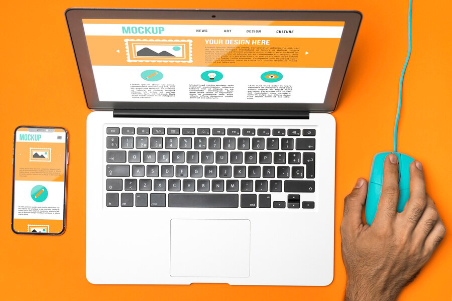
Responsive Design: Crafting Websites for Every Device
In today's digitally driven landscape, ensuring that websites are accessible and user-friendly across various devices is paramount. Enter responsive design: a methodology that revolutionizes web development by seamlessly adapting layouts and content to suit the unique dimensions and capabilities of different devices, be it a desktop, tablet, or smartphone. "Responsive Design: Crafting Websites for Every Device" encapsulates this transformative approach, emphasizing the need for websites to be not only visually appealing but also functional and accessible to users regardless of the device they use. This concept underscores the importance of fluidity and flexibility in design, enabling websites to dynamically adjust their appearance and functionality based on the user's screen size and orientation. By embracing responsive design principles, developers can create websites that deliver an optimal user experience, fostering engagement and satisfaction across diverse demographics and technological preferences. This introduction sets the stage for a deeper exploration into the principles, benefits, and implementation strategies of responsive design, illuminating its pivotal role in shaping the future of web development.
Understanding Responsive Design Principles
Responsive design is a fundamental approach in web development aimed at creating websites that adapt and respond to the user's device and screen size. It involves designing and coding websites in a flexible manner, ensuring that content layout, images, and navigation adjust seamlessly across different devices, from desktop computers to smartphones and tablets. The core principle of responsive design is to provide an optimal viewing experience, with easy reading and navigation, minimal resizing, panning, and scrolling, regardless of the device being used. This involves utilizing fluid grids, flexible images, and media queries to adjust the layout and presentation of content dynamically. By understanding these principles, web developers can create websites that are accessible and user-friendly across a wide range of devices, enhancing user satisfaction and engagement.
The Importance of Mobile-Friendly Websites
In today's digital landscape, where mobile usage surpasses desktop usage, having a mobile-friendly website is no longer optional but essential. Mobile-friendly websites ensure that users can access and interact with
content seamlessly on their smartphones and tablets, without encountering issues such as tiny text, unclickable buttons, or distorted layouts. Mobile optimization not only improves user experience but also boosts search engine rankings, as search engines like Google prioritize mobile-friendly websites in their mobile search results. Moreover, with the increasing trend of mobile shopping and browsing, having a mobile-friendly website is crucial for businesses to remain competitive and capture mobile-driven traffic. Overall, prioritizing mobile-friendliness is key to reaching and engaging with audiences effectively in today's mobile-centric world.
Key Elements of Responsive Web Development
Responsive web development involves integrating various key elements to ensure websites adapt fluidly to different screen sizes and devices. These elements include fluid grids, flexible images, and media queries. Fluid grids allow for the creation of layouts that adjust proportionally based on the user's screen size, ensuring consistent spacing and alignment across devices. Flexible images scale dynamically to fit the available space, preventing image distortion or overflow. Media queries enable developers to apply different styles or rules based on the characteristics of the user's device, such as screen width, orientation, or resolution. Additionally, prioritizing mobile-first design principles, where the
website is initially designed for mobile devices and then scaled up for larger screens, is essential in responsive web development. By incorporating these key elements, developers can create websites that deliver a seamless and optimized user experience across various devices.
Techniques for Cross-Device Compatibility
Achieving cross-device compatibility involves implementing techniques that ensure websites function and display correctly across different devices and browsers. One common technique is progressive enhancement, where websites are built with basic functionality that works across all devices, and then enhanced with advanced features for more capable devices. Another approach is graceful degradation, which involves designing websites with advanced features for modern devices, while ensuring basic functionality remains intact for older or less capable devices. Additionally, thorough testing on various devices and browsers is essential to identify and address compatibility issues early in the development process. Using standardized web technologies and adhering to web standards also contributes to improved cross-device compatibility. By employing these techniques, developers can create websites that provide a consistent and accessible experience for users across a diverse range of devices and platforms.

Optimizing User Experience Across Various Screens
Optimizing user experience across various screens involves more than just resizing and rearranging content to fit different devices. It requires a deep understanding of user behavior, preferences, and context across different devices and situations. Designing with a mobile-first approach allows developers to prioritize essential content and features for smaller screens, ensuring a streamlined and focused user experience. Additionally, optimizing touch interactions, such as using larger touch targets and intuitive gestures, enhances usability on touchscreen devices like smartphones and tablets. Consistent branding, navigation, and functionality across all devices contribute to a cohesive user experience, regardless of the screen size. Continuous testing and refinement, based on user feedback and analytics, are crucial in identifying areas for improvement and ensuring ongoing optimization across various screens. By prioritizing user experience and tailoring design and functionality to different devices, developers can create websites that engage and delight users across the entire spectrum of screen sizes.
Responsive Design Best Practices and Trends
Stay ahead in the ever-evolving world of web design by embracing responsive design best practices and keeping up with the latest trends.
- Utilize Fluid Grids and Flexible Images
- Prioritize Content Adaptation and Accessibility
- Implement Media Queries for Device-Specific Styling
- Embrace Mobile-First Design Principles
- Stay Updated with Emerging Design Trends
By incorporating these best practices and staying abreast of current trends, you can ensure your websites are not only visually appealing but also functional and accessible across various devices.
Tools and Resources for Implementing Responsive Websites
Building responsive websites efficiently requires the right set of tools and resources. Here are some essential ones to streamline your workflow.
- Frameworks like Bootstrap and Foundation
- CSS preprocessors such as SASS and LESS
- Responsive design testing tools like BrowserStack and Responsinator
- Icon fonts and SVGs for scalable graphics
- Online resources like tutorials, forums, and design communities
Armed with these tools and resources, you can navigate the complexities of responsive web design more effectively, resulting in websites that look great and perform seamlessly on any device.
Conclusion
Responsive design is essential for crafting websites that deliver optimal user experiences across all devices. By adapting layouts, images, and functionalities to various screen sizes, businesses can reach and engage a broader audience. This approach not only enhances user satisfaction but also boosts search engine rankings, driving more organic traffic to your site. At Ideation Digital Marketing, we specialize in creating seamless and adaptive web designs that cater to the dynamic needs of today’s digital landscape. Our expertise in responsive design helps your business stay ahead of the curve, providing visitors with a smooth and enjoyable browsing experience, whether they're on a smartphone, tablet, or desktop.
If you’re ready to transform your website and elevate your digital presence, we’re here to help. Contact us at Ideation Digital Marketing in Charleston, WV, to discuss your web design needs. Our team of skilled professionals is dedicated to crafting innovative and effective solutions tailored to your unique goals. Reach out to us today at (304) 814-2445 to start your journey toward a more responsive and user-friendly website. Let’s work together to create a digital experience that captivates and converts.
FOLLOW US


Main Office
222 Capitol Street, Suite 522
Charleston, WV 25301
other offices
48 1/2 Second Ave, Williamson, WV 25661
20 Clinch Mountain Ave, Lebanon, VA 24266,
Contact