222 Capitol Street, Suite 522
Charleston, WV 25301


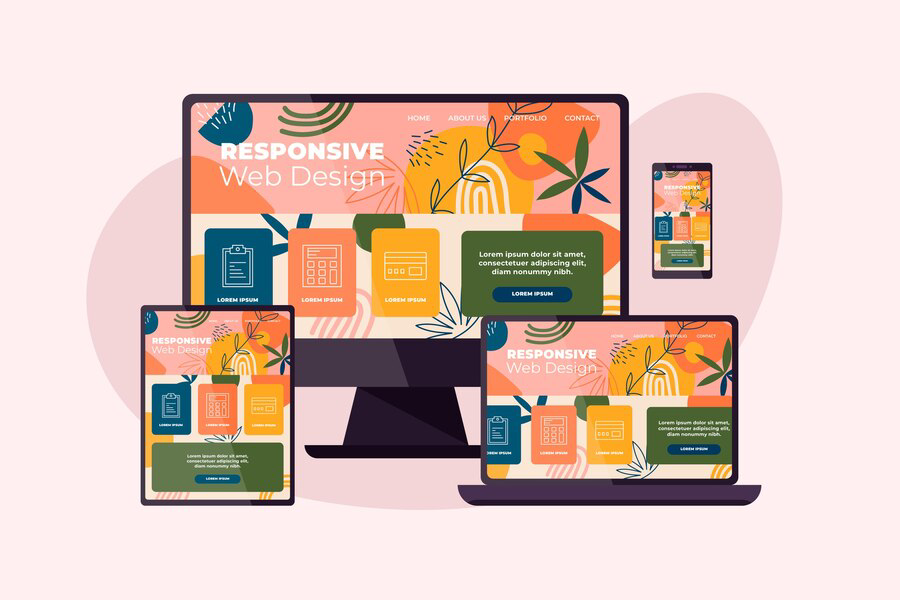
Responsive Design: The Key to Successful Website Development
In the ever-evolving landscape of web development, one principle stands out as indispensable: responsive design. It's not just a buzzword; it's the cornerstone of successful website development in today's digital age. As the variety of devices used to access the internet continues to expand, from smartphones to tablets to desktop computers, ensuring that your website looks and functions flawlessly across all platforms is no longer just a nice-to-have—it's a necessity. In this blog post, we'll delve into the importance of responsive design, its impact on user experience and SEO, and practical tips for implementing it effectively. Whether you're a seasoned web developer or just starting out, understanding responsive design is crucial for creating websites that truly shine in the modern online landscape. Let's dive in and explore why responsive design is the key to unlocking success in website development.
Why Responsive Design Matters More Than Ever in Website Development
In today's digital age, where smartphones, tablets, laptops, and desktop computers are all integral parts of our daily lives, the importance of responsive design in website development cannot be overstated. Responsive design refers to the approach of creating websites that adapt and respond seamlessly to the various screen sizes and devices on which they are viewed. This flexibility ensures that users have a consistent and optimized experience regardless of the device they use to access the site. Here's why responsive design matters more than ever in website development:

- Ubiquitous Mobile Usage: With the proliferation of smartphones and tablets, more and more people are accessing the internet on mobile devices. In fact, mobile traffic has surpassed desktop traffic in recent years. Therefore, it's essential for websites to be optimized for mobile devices to accommodate this shift in user behavior.
- Enhanced User Experience: A responsive website provides users with a smooth and enjoyable browsing experience across all devices. By automatically adjusting the layout, content, and functionality based on screen size, responsive design eliminates the need for users to pinch, zoom, or scroll excessively to view and interact with the content. This results in higher user satisfaction and engagement, leading to longer dwell times and increased conversions.
- Improved SEO Performance: Search engines like Google prioritize mobile-friendly websites in their search results. Websites that are not optimized for mobile devices may experience lower rankings in mobile search results, which can negatively impact organic traffic and visibility. By implementing responsive design, websites can improve their SEO performance and attract more organic traffic from mobile users.
- Cost-Efficiency: Maintaining separate desktop and mobile versions of a website can be time-consuming and costly. With responsive design, developers only need to create and maintain one website that works seamlessly across all devices. This not only reduces development and maintenance costs but also ensures consistent branding and messaging across platforms.
- Future-Proofing: As new devices with varying screen sizes and resolutions continue to emerge, responsive design offers a future-proof solution. By designing websites to adapt to any screen size, developers can ensure that their websites remain accessible and functional on upcoming devices without the need for major redesigns or overhauls.
The Evolution of Responsive Design: From Desktop to Mobile
Responsive design has revolutionized the way websites are built and experienced, transforming the digital landscape from one primarily focused on desktop computing to a multi-device ecosystem where mobile devices reign supreme. The evolution of responsive design has been shaped by advancements in technology, changes in user behavior, and the need for websites to adapt to the diverse array of devices used for accessing the internet. Let's explore how responsive design has evolved from its origins in desktop computing to its pivotal role in optimizing websites for mobile devices.
Desktop-Centric Design
In the early days of the internet, websites were primarily designed for desktop computers with fixed screen resolutions. Developers created layouts that were optimized for standard monitor sizes, resulting in static designs that did not adapt well to different screen sizes or devices. This approach worked well for the predominantly desktop-based internet users of the time but presented challenges as mobile usage began to rise.
Emergence of Mobile Devices
With the advent of smartphones and tablets, the way people accessed the internet underwent a dramatic shift. Suddenly, users were accessing websites on devices with smaller screens, touch interfaces, and varying resolutions. Traditional desktop-centric websites were not optimized for these devices, leading to a poor user experience characterized by pinch-to-zoom gestures, horizontal scrolling, and distorted layouts.
Introduction of Responsive Design Principles
Recognizing the need to provide a consistent and user-friendly experience across all devices, web developers began experimenting with new design approaches. Responsive design emerged as a solution, advocating for flexible layouts, fluid grids, and media queries that allowed websites to adapt dynamically based on the screen size and orientation of the device being used. This approach marked a fundamental shift in how websites were designed and laid the foundation for the modern web.
Adoption of Mobile-First Design
As mobile usage continued to soar, designers and developers began embracing a mobile-first approach to web design. Instead of starting with the desktop version of a website and then scaling down for smaller devices, they started by designing for mobile screens and then progressively enhancing the layout for larger screens. This approach ensured that websites were optimized for the smallest screens first, prioritizing simplicity, performance, and usability.
Evolution of Design Tools and Frameworks
The evolution of responsive design has been facilitated by the development of design tools and frameworks that streamline the process of creating adaptive layouts. Tools like CSS frameworks (e.g., Bootstrap, Foundation) and responsive design testing tools have made it easier for developers to build responsive websites efficiently. Additionally, advancements in web development technologies, such as CSS Grid and Flexbox, have provided more powerful and flexible layout options.
Conclusion
Responsive design stands as the cornerstone of successful website development, ensuring optimal user experience across various devices and platforms. As exemplified by Ideation Digital Marketing located at 222 Capitol St. Suite 522, Charleston, WV 25301, USA, their commitment to responsive design reflects a strategic understanding of the modern digital landscape. By prioritizing adaptability and accessibility, businesses can effectively engage with their audience, foster brand loyalty, and ultimately drive sustainable growth.
FOLLOW US


Main Office
222 Capitol Street, Suite 522
Charleston, WV 25301
other offices
48 1/2 Second Ave, Williamson, WV 25661
20 Clinch Mountain Ave, Lebanon, VA 24266,
Contact